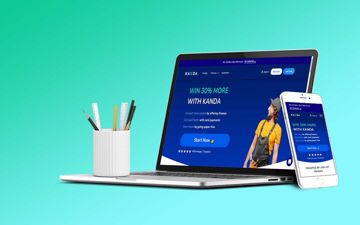
Faster completion rate with crafting seamless experiences as UX designer at Kanda
www.getkanda.comProject Objective
The goal of the Kanda platform was to simplify property management processes, especially for tradeperson by centralizing operations and financing in a single and intuitive platform. Its aimed to enhance task management, streamline communication, and create a cohesive experience for all users and parties, including property managers, tenants, and service providers.
Challenges
The existing processes for tradeperson and homeowner were often fragmented, inefficient, and lacked of digital tools for effective communication. My task was to design a platform that addressed these inefficiencies while ensuring ease of use and scalability for diverse user needs. There are fews and not much references to look for, and that made another level of difficulty to understand different region approach, as I am living in Asia region and my client is in Europe region.
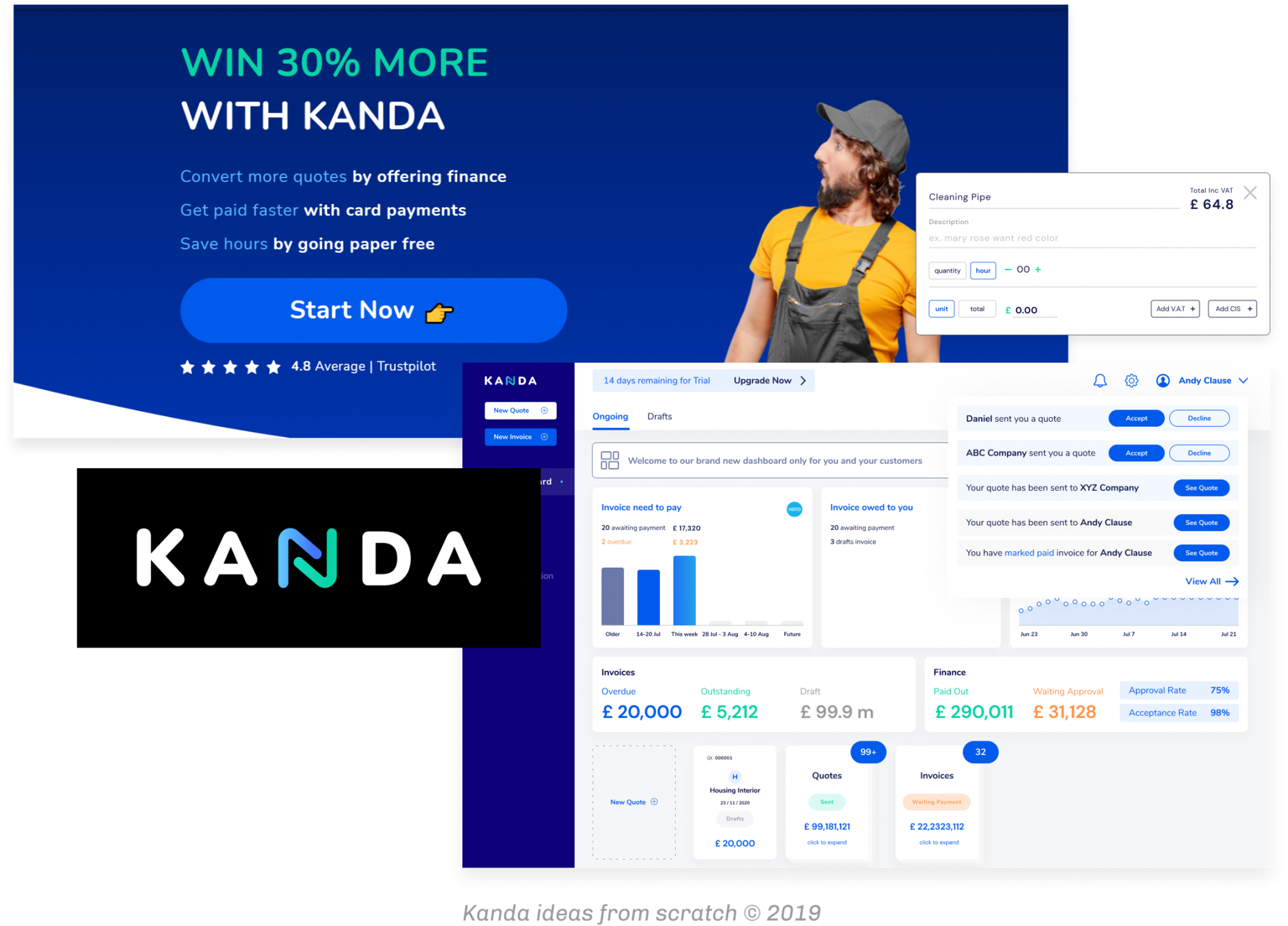
Process and Approach
User Research and Discovery
I began by conducting interviews with stakeholders, and he got me some feedbacks from homeowners and tradeperson to understand their daily challenges and expectations. These insights formed the foundation for creating user-centered designs that addressed the needs of all parties involved.
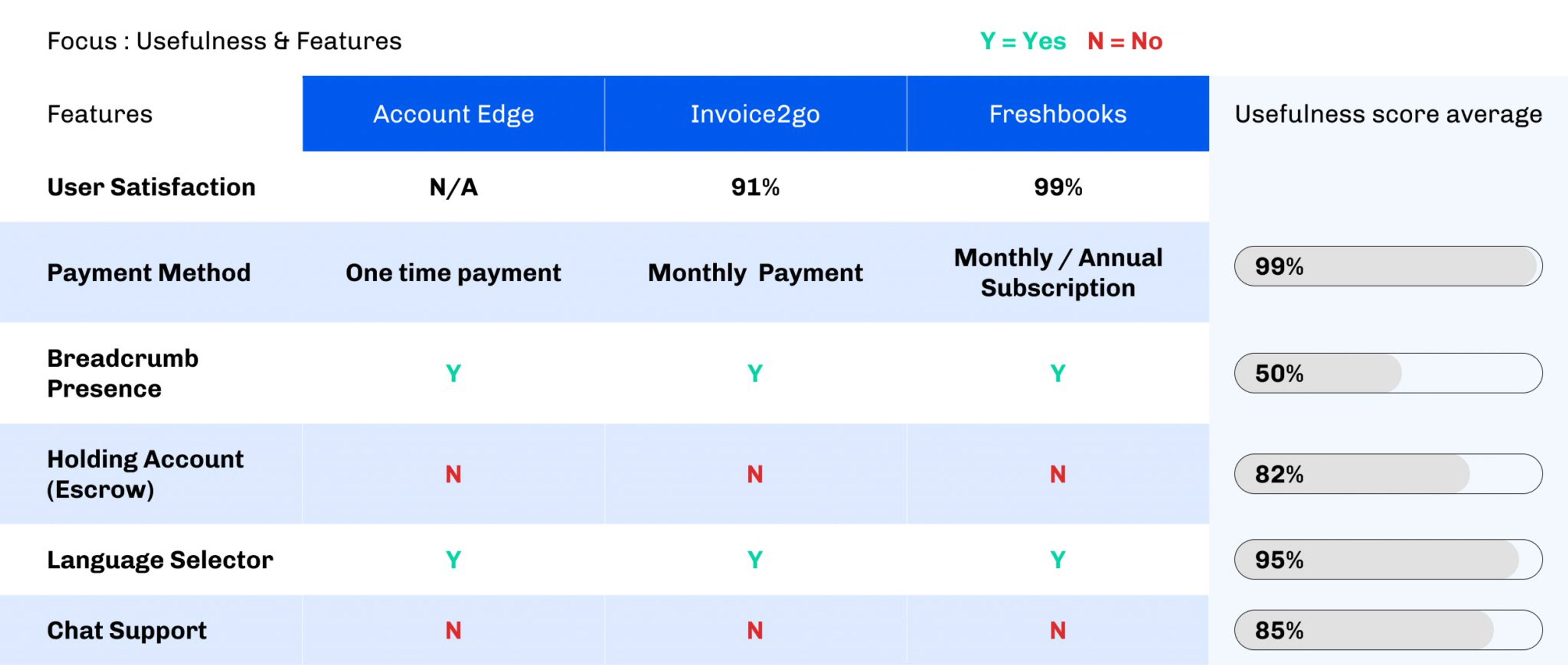
Then, as I worked remotely with these project, the efficient ways to gather insights from survey and feedback through platforms integration and stakeholders contact. I also did some comparison analysis regarding the feedback provision.
Wireframing and Prototyping
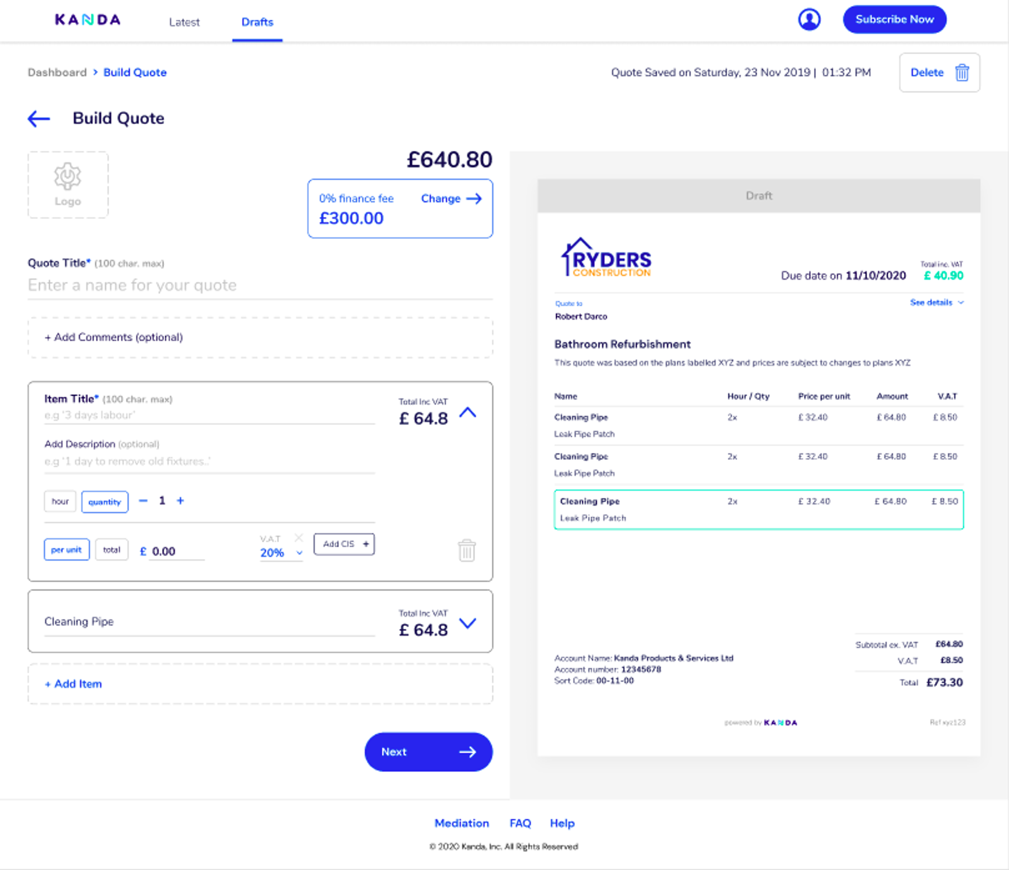
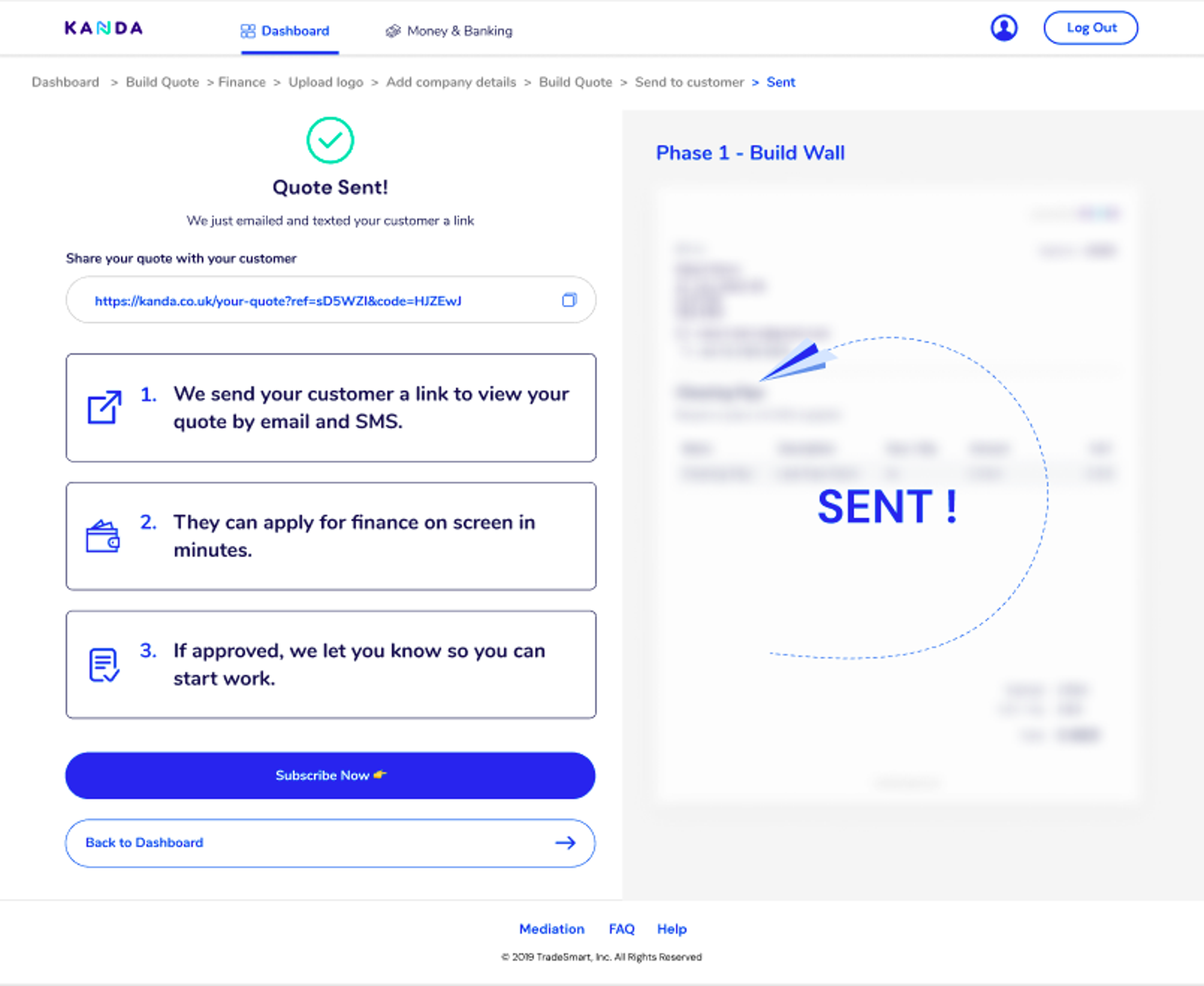
Based on the research findings, I developed user flow with wireframes to outline key of interactions.
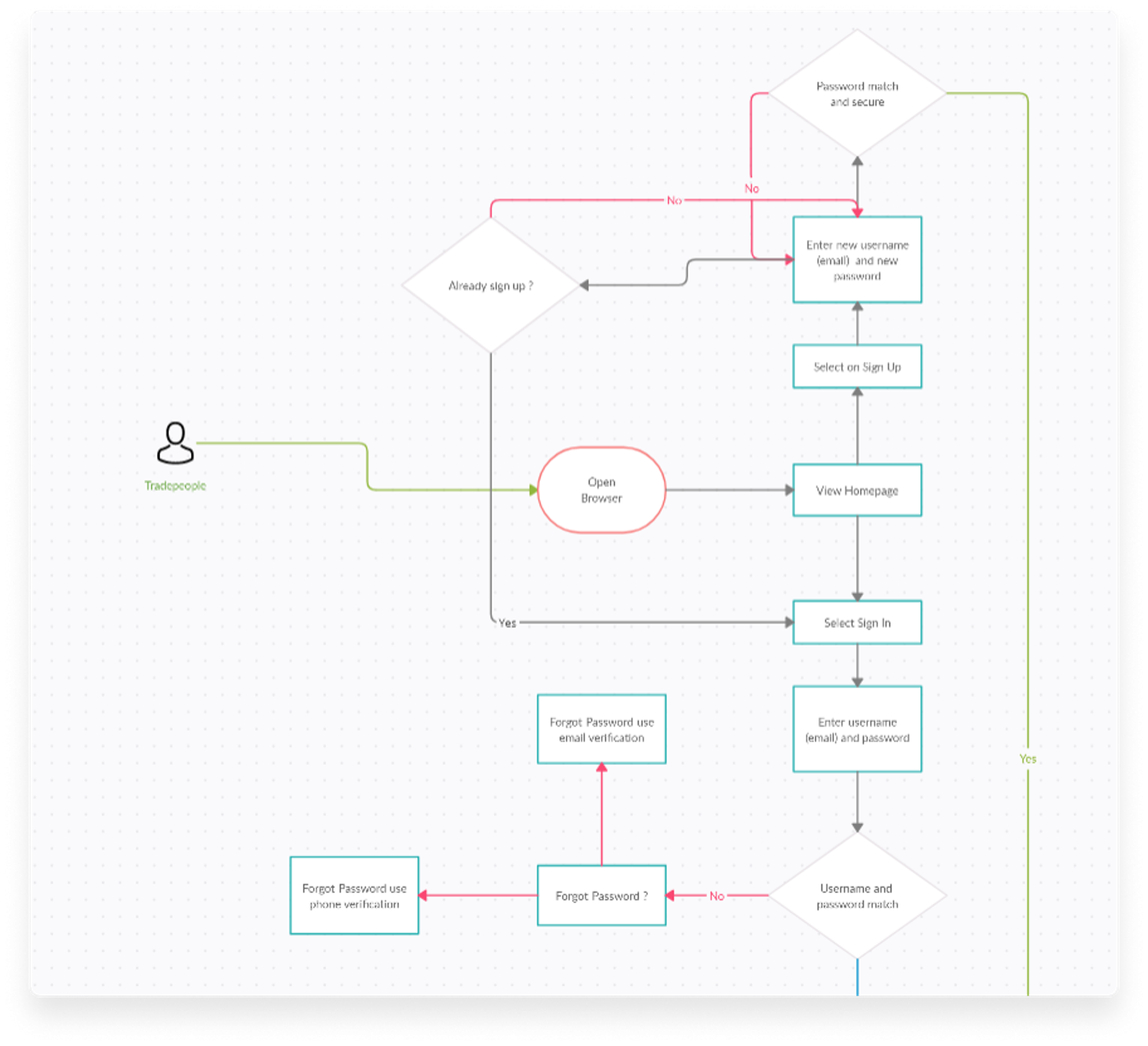
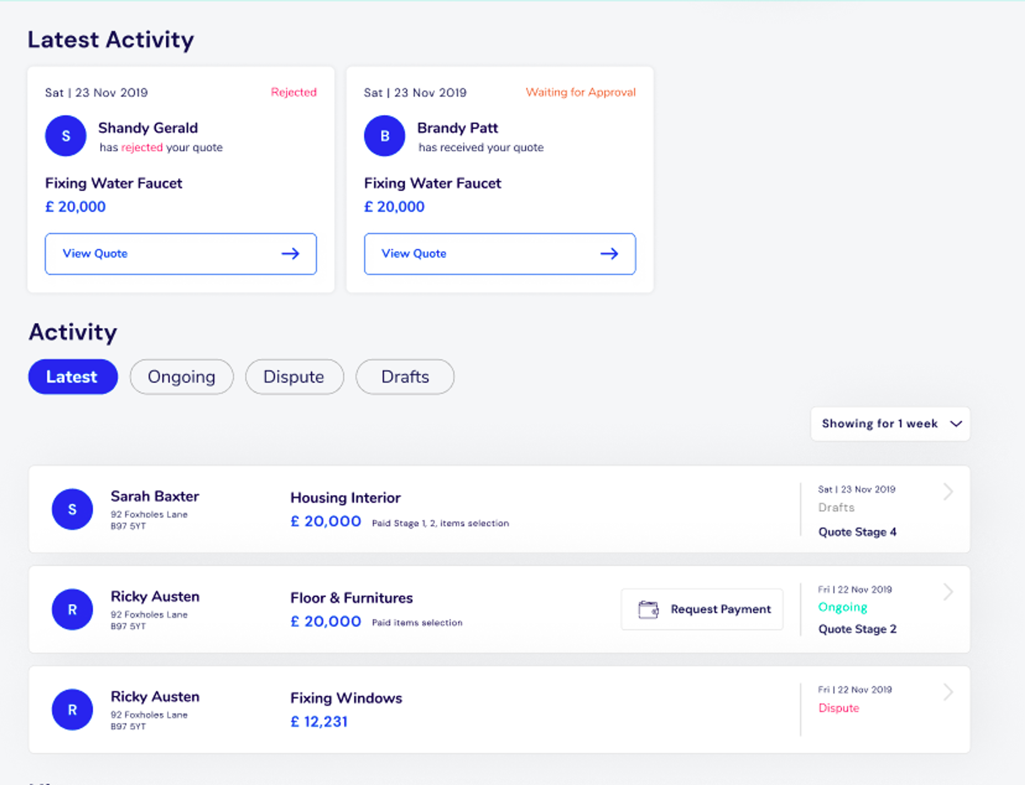
These were then transformed into wireframe, focusing on improving task management and communication efficiency within the app.

Prototypes and Iteration
Prototypes were tested with real users in live version. This tracking and iterative process allowed me to refine the designs, ensuring they met user needs and resolved identified pain points effectively.
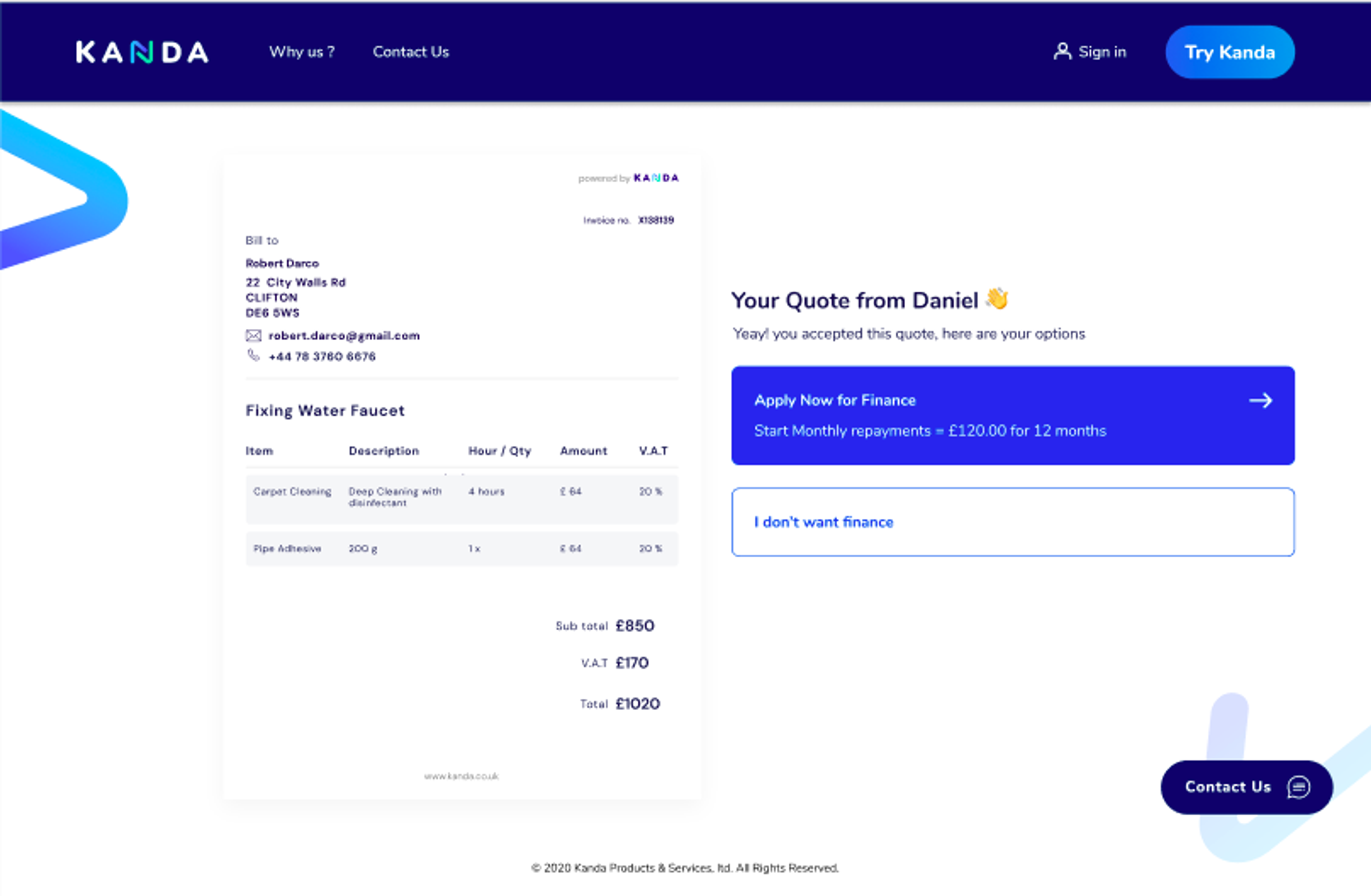
For example, in the website homepage, we implement highlights of the features and point for different from competitors. It made it look more trusted with some testimonials word from real trade people. Then we implemented heatmap and click analytics to know how user interact with the website.

Results and Impact
The redesigned Kanda platform delivered significant improvements in property management efficiency:
- Enhanced Usability
Simplified workflows made it easier for tradeperson to handle tasks and resolve issues quickly with homeowner.
- Streamlined Communication
Improved channels for homeowner financing and reduced response times with increased satisfaction for tradeperson.
- Scalable Design
The platform was built to accommodate future growth, ensuring it could adapt to the evolving needs of users.
Conclusion
The Kanda project was a rewarding experience that highlighted the importance of understanding user needs in developing effective property management solutions. By bridging the gap between stakeholders and end users, we created a platform that not only resolved inefficiencies but also set the stage for scalable growth. This project reinforced the value of user-centered design in delivering impactful digital products that meet complex operational demands.